SNKRS
Duration: 3 weeks
Tools: Figma, Google Forms, Illustrator
Platform : IOS
My Role : Research, User Interviews, Wireframing, Visual Design
*This project is not affiliated with or sponsored by the actual brand. This is a concept study.
Client
Nike, Inc., is an American sportswear company headquartered in Beaverton, Oregon. It was founded in 1964 as Blue Ribbon Sports by Bill Bowerman, a track-and-field coach at the University of Oregon, and his former student Phil Knight. They opened their first retail outlet in 1966 and launched the Nike brand shoe in 1972.
Nike continuously explores ways to connect with their communities, one of which are “Sneakerheads”, or people who collect and trade sneakers as a hobby. Their app, SNKRS, provides “insider access to the latest launches, hottest events, and exclusive releases that Nike has to offer.”
Challenge
SNKRS app users who are passionate about sneakers can’t get in touch with like-minded individuals and/or share ideas with each other. My team was challenged to create a community feature for the SNKRS App that will help users connect with each other on their love for Nike, showcase their interests or preferences as well as share their Nike sneakers collection with their friends. You may come for the sneakers, but we promise you’ll stay for the community.
Key Drivers
As part of Nike’s initiative to become a digital-first, direct-to-consumer (D2C) company, Nike has set out to reach 30% of its total sales driven by e-commerce revenue. For this project, Nike wants to release a new feature that allows users to connect with one another and create a community. The goal of this project is to design a feature for customers to discuss and share their love for Nike sneakers. Similar to the Reddit forums, buying, selling, and trading shoes on the app would be prohibited.
Requirements
Display what sneakers they already own.
Verify the legitimacy of a pair they own.
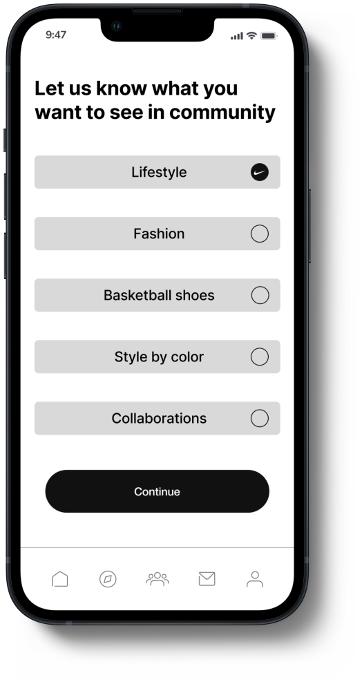
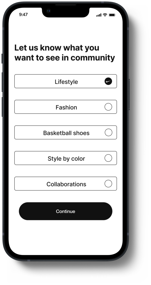
Showcase their interests or preferences (lifestyle, fashion, basketball shoes, certain colors, or collabs).
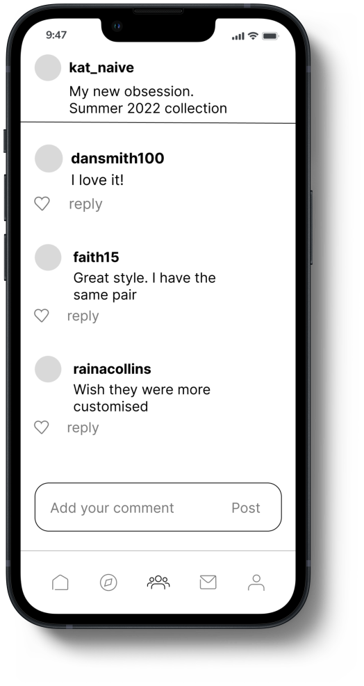
Post and reply to content.
Research & Planning
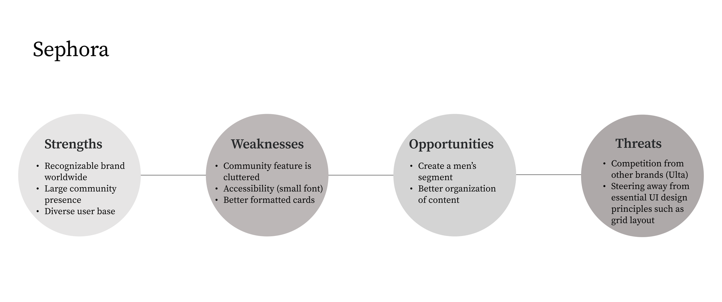
The simplest starting point was to conduct secondary research and perform a SWOT analysis. We wanted to learn more about Nike, and its direct competitor, Adidas. We also wanted to see if there were any existing applications that utilized a community feature. We were unable to find any applications that were direct competitors to Nike with a community feature so we shifted course and began to research indirect competitors. Sephora was one of the only brands we could find that had a community feature as well as Reddit.
User Research
After gaining much insight, we decided to conduct a survey to better understand our users. We wanted to find out what applications they utilized to purchase sneakers, how they discovered new sneaker styles, what they didn’t like about the SNKRS app, and also what social media applications they used, and what features from those apps would they love to see in the SNKRS app. We also wanted to find out if users were even interested in wanting to connect with others on the SNKRS app.
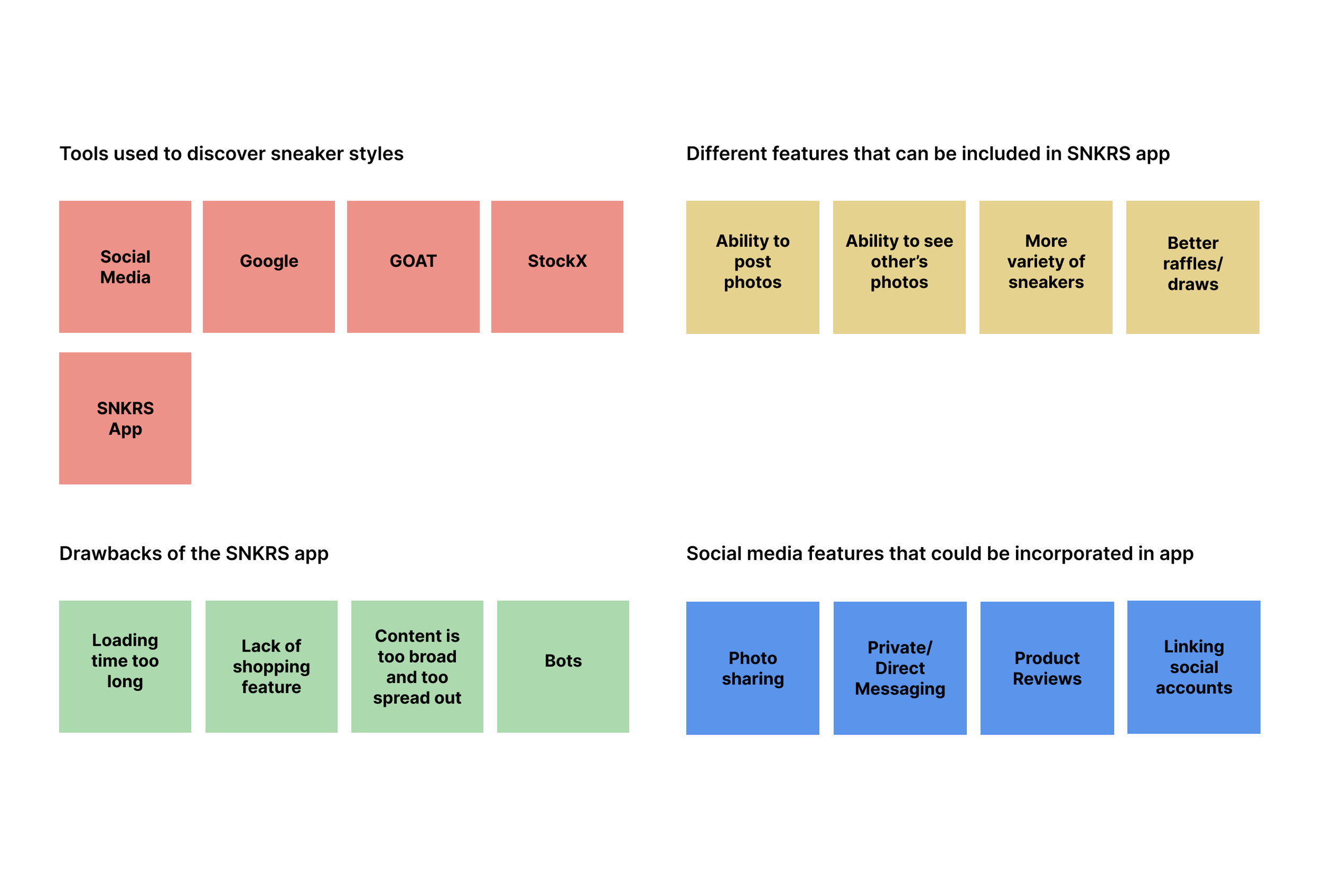
With responses received from 32 participants, we created an affinity map to help synthesize the data into categories that would allow us to better understand our users.
There were many clear trends that emerged when we synthesized the data collected from the survey. Most users used Instagram to discover sneakers styles and keep up with the latest trends. Most users also liked most of the functionalities of social media apps like Instagram and would love to see those functionalities incorporated into the community feature of the SNKRS app.
The SNKRS community feature would not encompass all the features of social media but given that the target users are very similar, we began thinking about those core features and how we could utilize them for this new feature while also setting the SNKRS community feature apart from its competitors.
Affinity Map
Persona
With the data collected were able to come up with a persona that depicted the average user of the SNKRS app.
Designing the Solution
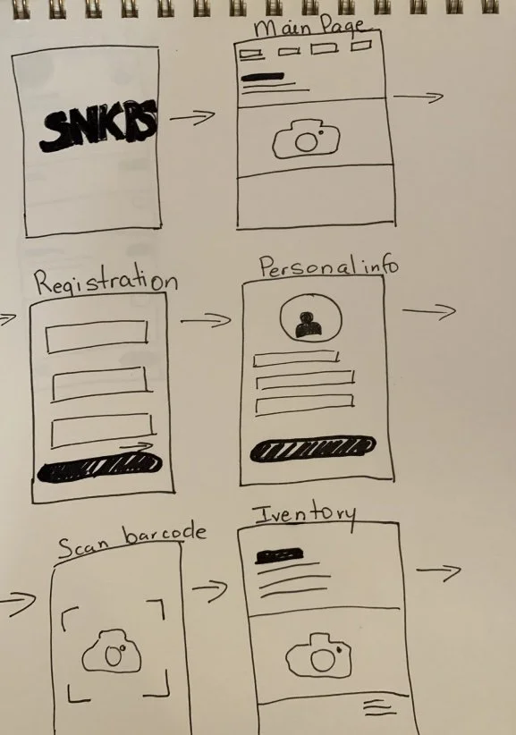
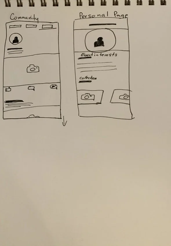
We created a simple sketch of our app based on the user information we collected and also the key drivers we were tasked with to create our designs.
Wireframes
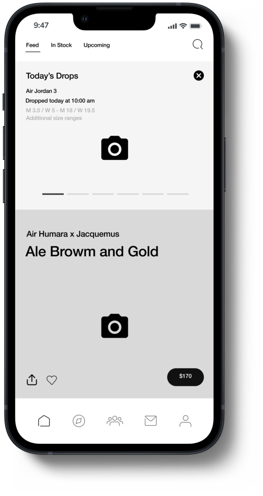
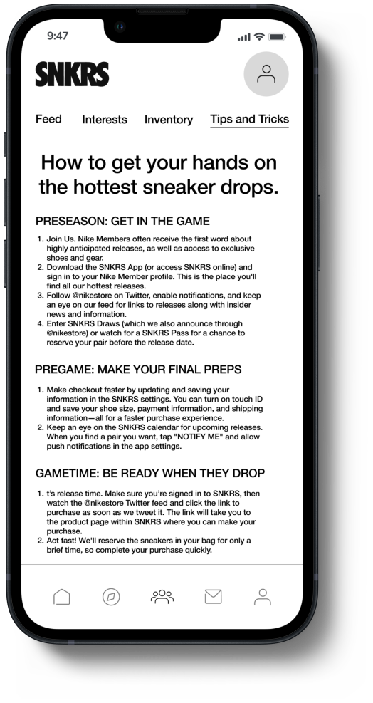
Next, we proceeded with mid-fidelity wireframes to build out our design and better visualize what the new community feature would look like. We wanted to ensure that the new community feature effortlessly enhanced the SNKRS app while maintaining the same look and feel as the current application.
Early Sketches
Usability Tests
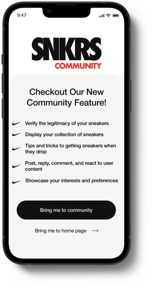
After conducting usability tests, we came to the conclusion that we needed to add a pop-up screen that would allow users to learn about the community feature before creating a profile. Most users were not aware of what the community feature was and therefore were hesitant to create a profile.
We also observed that there were accessibility issues with some of the icons and the smaller font but due to the limitations of the project brief, we were not allowed to change the style of the elements and components the SNKRS app currently use.
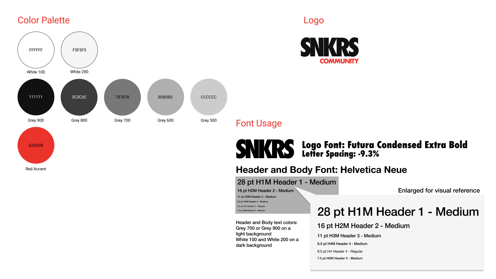
Before moving into high-fidelity, we created a style guide to help keep us in alignment and cohesive with the current brand. We were not able to locate Nike’s current style guide so we did our best using tools like the eye dropper tool to identify the specific colors Nike used for the SNKRS app. We also used the WhatTheFont tool to help us with identifying the correct fonts used.
Style Guide
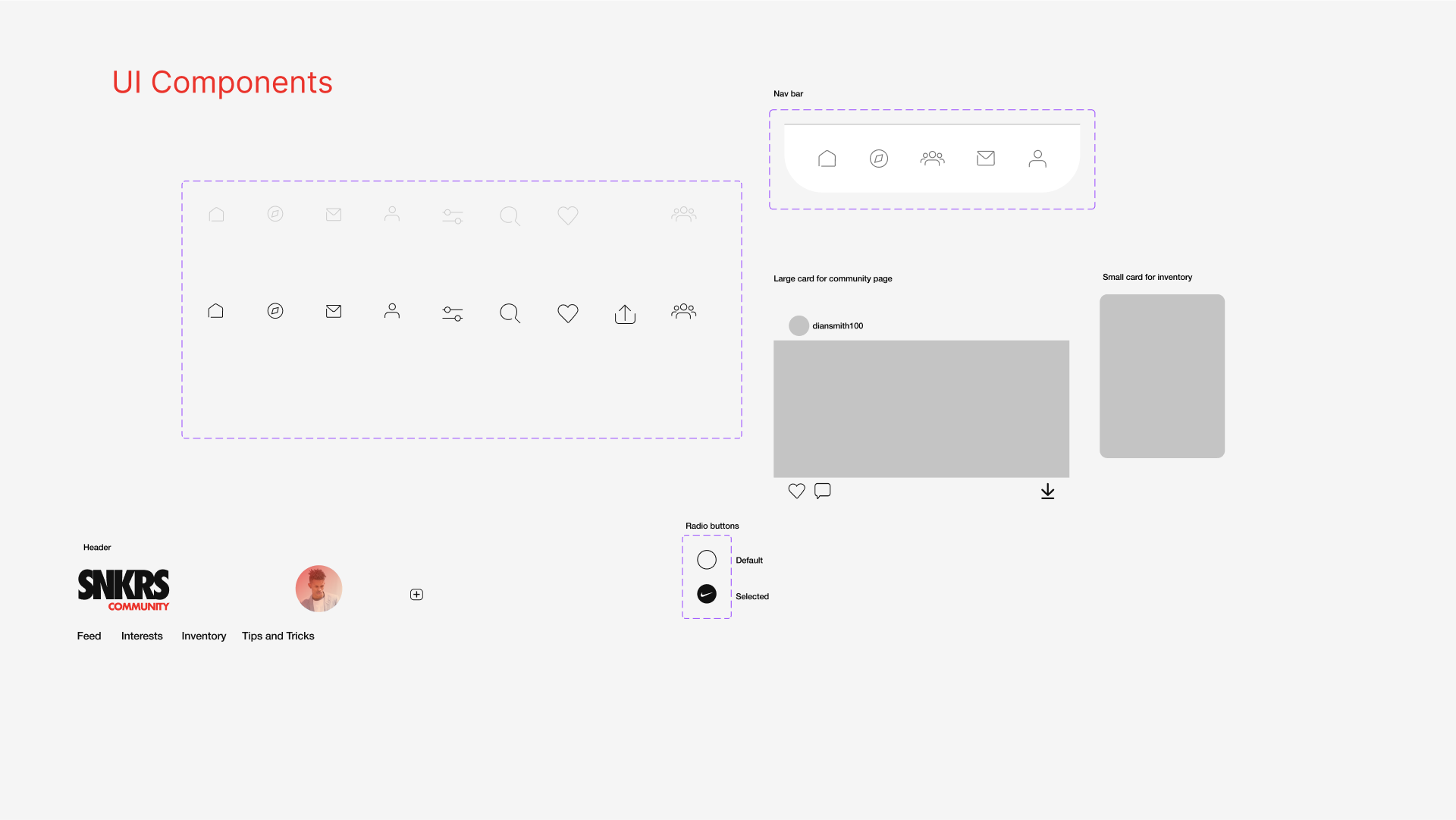
We also did our best to recreate the different UI elements and components that already made up the app as well as adding a few new ones that we created for the community feature. Coming up with a name for the new feature was a no brainer. I just took the current current logo and added a ‘Community’ under it to help users differentiate the new feature.
High Fidelity & Prototype
After the addition of a few screens and design details, we created a high fidelity and prototype of the new community feature.
Design Testing
After creating high-fidelity wireframes, my team and I performed the Nielsen Norman Group Visual Flat Test on 13 users. Users were given 15 reaction words which included both positive and negative words. They were shown the app and asked to choose 5 words from the list that described their first impressions of the app. The below words were chosen numerous times.
Consistent
Appealing
Modern
Fresh
Straightforward
Engaging
Clean
Conclusion
Since the SNKRS community feature was a conceptual feature, we could only qualitatively assess how well our design accomplished the goals defined in the project brief. Our design testing above showed that users found the new feature to be straightforward, consistent, engaging, and appealing. Usability testing indicated that despite accessibility issue with some icons and the smaller font, users were able to complete tasks related to posting and replying to content as well as sharing their preferences. They all expressed how useful the new feature was and how they could see themselves actually using it.
What I’d do differently?
If there was more flexibility with the project brief requirements, I would have pushed to redesign more accessible icons and fonts for the application. If a few users had the same issues, I can only imagine how many more users of the actually app feel the same way.
What’s next?
I would like to design a few more screens to the wireframes to help the user better visualize how certain parts of the app will function. It will also provide for an even better usability testing experience.
