Clean Conscious
Design for Good Project
Duration: 8 weeks
Tools: Figma, FigJam
Platform: IOS
My Role: Research, User Interviews, Wireframing, Visual Design
Client
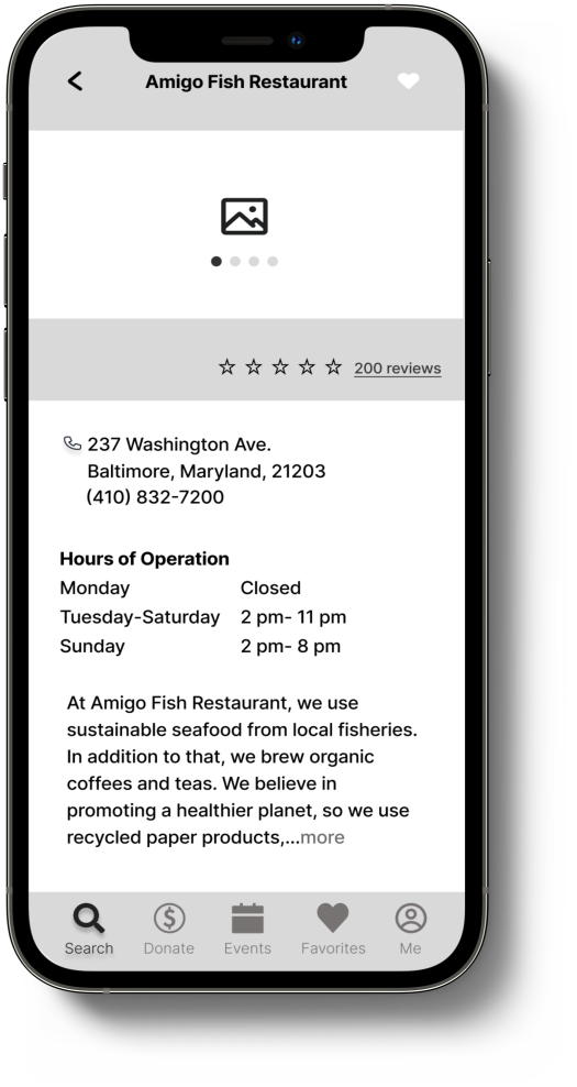
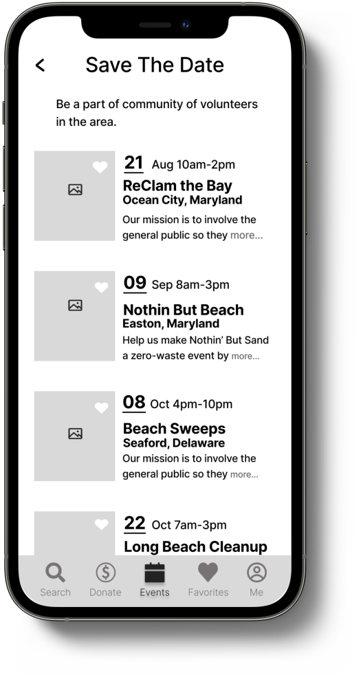
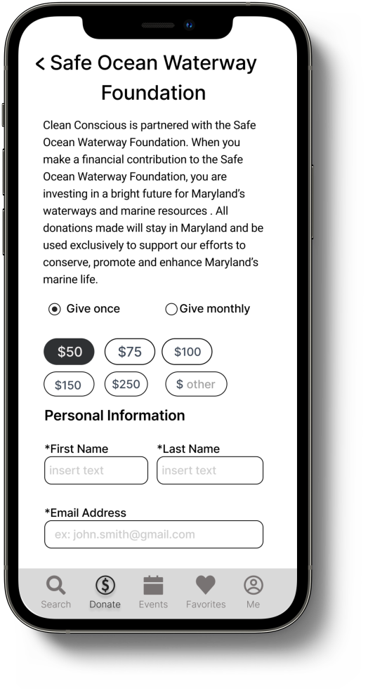
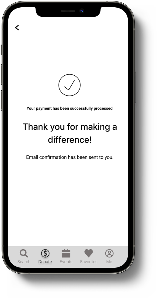
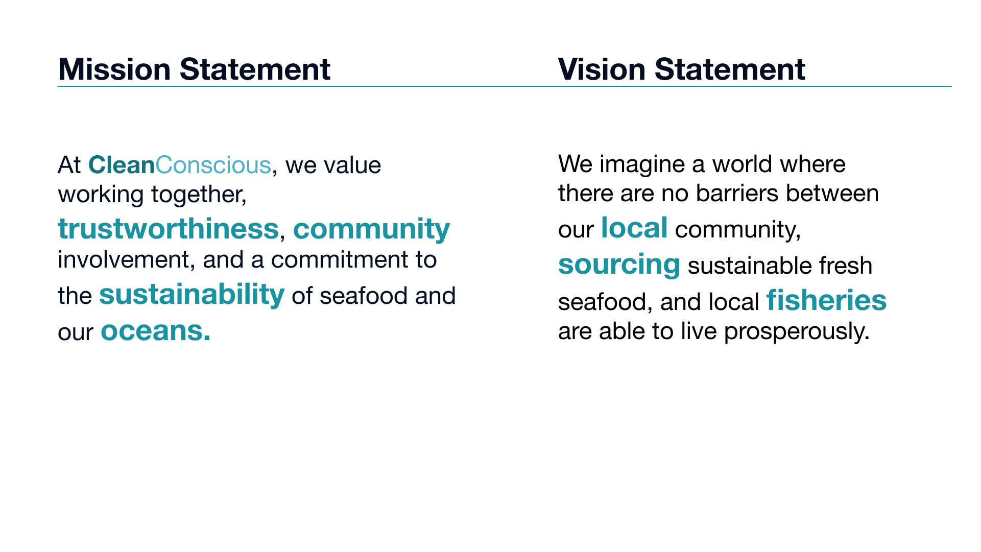
I had the opportunity to work with a team in developing a native iOS application called CleanConscious. CleanConscious connects both restaurant owners and customers who share the same views on sustainable and good-quality seafood. As a customer, they will be able to see restaurants that are focused on sustainable seafood, with mostly wild-caught options. A restaurant owner will be able to find the source of the seafood (local fish markets, restaurant depots) where they can purchase their seafood from. It will also provide both groups with a way they can participate in positive water pollution community initiatives, and donate to the cause. Because of the project timeframe, we will be focusing on the customer part of the journey.
Challenge
Now more than ever, ethical businesses need to transparently show conscientious consumers what kind of effect their product or service has on the environment. How might we help ethical businesses display their restaurants and stand out from other places that are not environmentally aware?
Clean Conscious wants to connect both restaurant owners and customers who share like-minded views on sustainable and quality seafood.
Key Drivers
In order to accomplish our objectives and tackle this challenge, we needed our users to be able to:
Research and Planning
When we came up with the idea for this application, we decided that it would first be necessary to conduct some secondary research to see if there were any applications like this out there. We also wanted to see how easy it was to access the information we were going to put into the Clean Conscious app. For example, we discovered that it was not easy to find local community service initiatives to participate in. We also discovered that most restaurants’ food sources are not easily accessible to the public, which means most people are not aware of what they are consuming.
Next, we moved on to our target audience. In order to gain an understanding of our target audience in terms of what they knew about sustainable seafood and conservation, we conducted one-on-one moderated interviews.
We wanted to find out the following:
How do restaurant customers go about searching for a place to eat?
How do they feel about the quality of the seafood they consume at restaurants?
Are they interested in participating in events that help to clean shorelines?
Are they interested in donating to causes that help with marine life conservation?
Based on our responses, we created an affinity map to help us better synthesize the data.
Persona
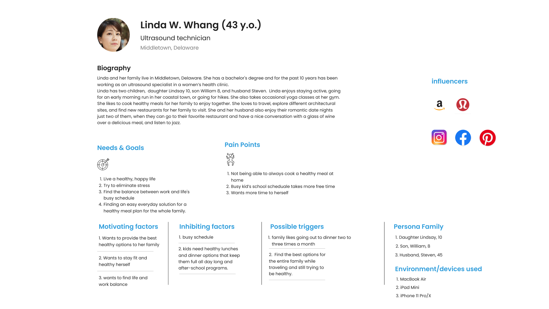
The data revealed that most of our participants were interested in social/community events that help with keeping the shorelines clean but were not sure how to find these events. They were also aware of the effects of water pollution and how it can affect the seafood they eat. Most also felt that the quality of seafood they ate at restaurants wasn’t bad but they had no idea where it came from or if it was the best quality. All the of the participants expressed their interest in the Clean Conscious application and felt that it would be useful to their everyday lives.
With the data collected were able to come up with a persona that depicted the average user of the Clean Conscious App.
Designing the Solution
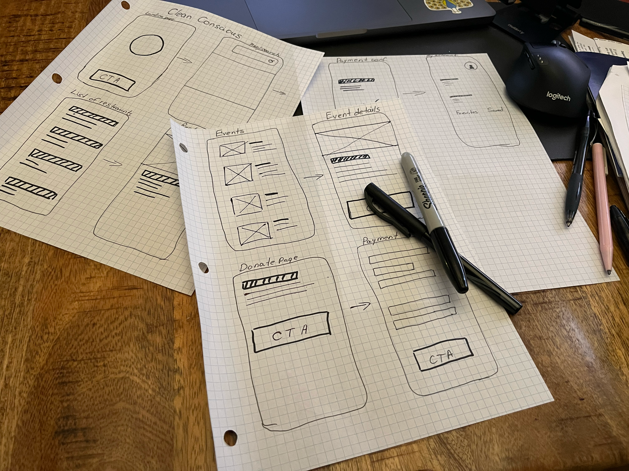
Early Sketching
Now that we had a better idea of our who our customers are, their interests and concerns, we started sketching out our app design. We each did individual sketches of the application and then shared them with our group. From there we, began to create wireframes.
Wireframes
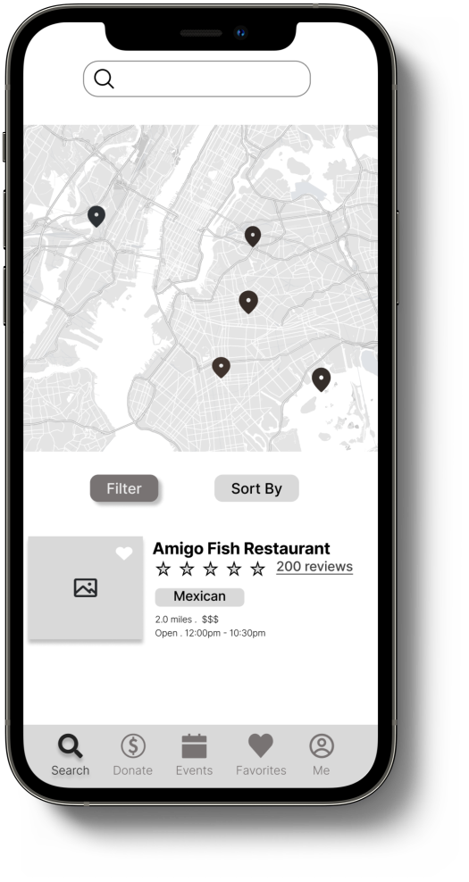
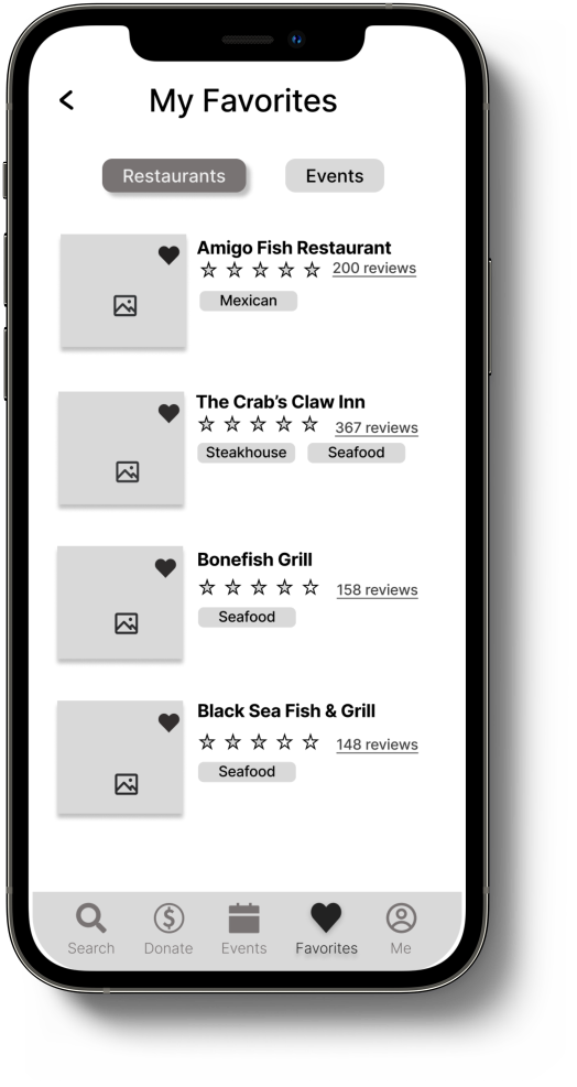
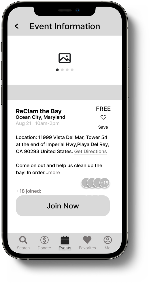
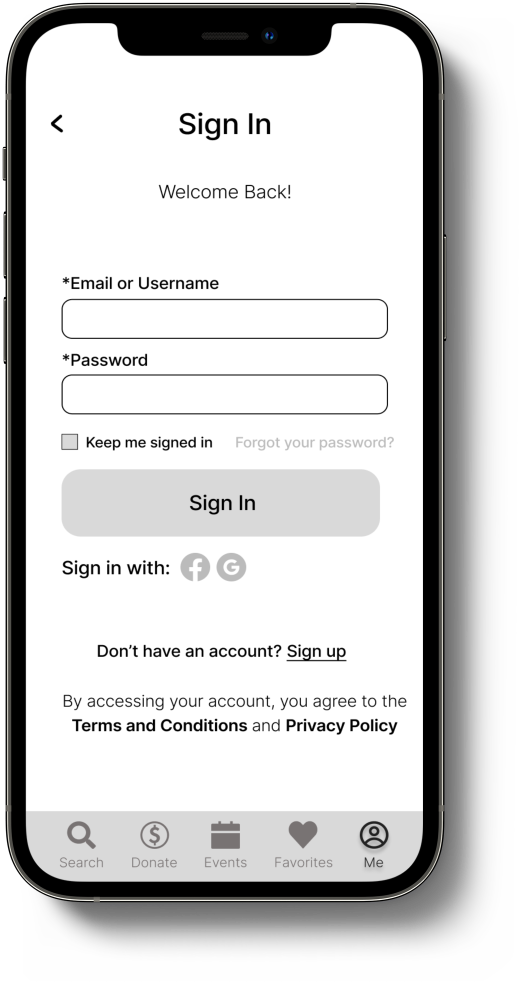
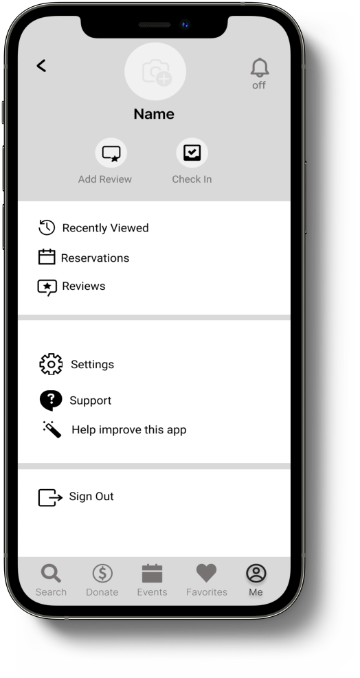
Next, we proceeded with mid-fidelity wireframes to build out our design and better visualize what Clean Conscious would look like. We kept in mind our key drivers for the application while also making sure that Clean Conscious would be simple and easy to use on the go.
Usability Testing
After completing the mid-fidelity wireframes, we conducted some usability testing. We wanted to see how well users understood the application as well as their thoughts on how we could make it better for them. I was able to conduct tests on five people and the results gave me very useful information to help us improve the usability.
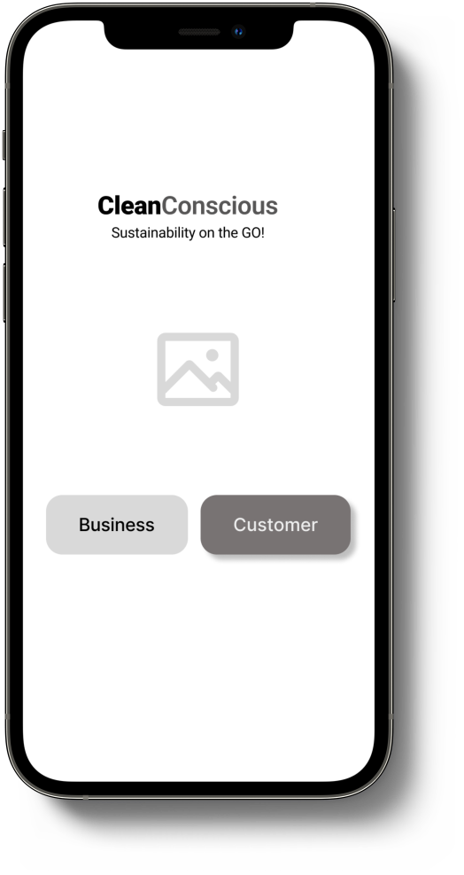
Testing revealed that we needed to we needed an introduction page that popped up when users opened the application. Most users were confused as to what the application was about and an introduction page would help take away the guessing. We also broke up the donation page into two pages to make it more digestible for users.
Style Guide
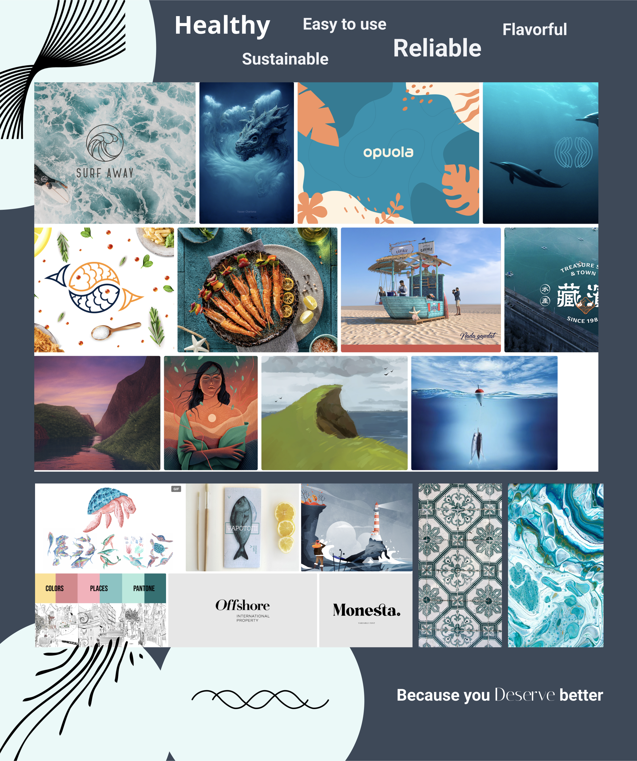
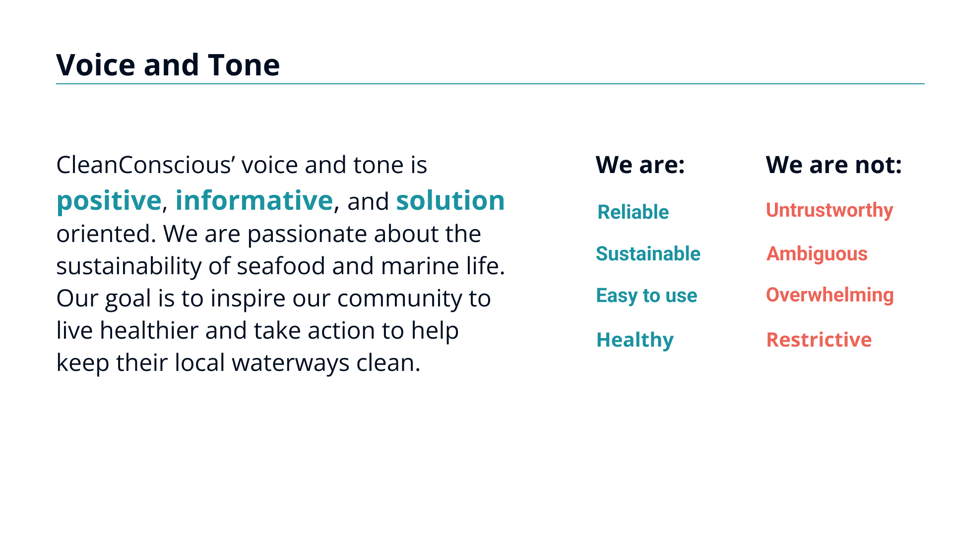
Since the Clean Conscious application did not have a brand identity, we created a style guide that we felt told a story of what the brand represents. To start, we created a mood board that helped us build out the style guide. From there, we were able to create a complete style guide for Clean Conscious.
High-Fidelity & Prototype
Design Testing
After designing and prototyping the high-fidelity wireframes, we tested for the users’ first impressions of the app. I conducted two visual tests, the Five-Second test and the First Click Test with four users.
Five Second Test
For this test, users were asked to look at the splash screen and then give their thoughts on what they thought the app was about. Three users thought the app was for ordering seafood from restaurants and one user thought it was an app for an aquarium.
First Click Test
For this test, users were asked to perform two tasks. First, they were asked to search for a restaurant, and then they were asked to add a restaurant to their ‘Favorites’. Two users clicked on the ‘Search’ tab and tried to input into the search bar while the other two users clicked on the map first. All users were able to add a restaurant to their favorites.
Conclusion
Overall, our team did a great job at delivering our key drivers into a usable and accessible product. We were very proud of the brand we created from the ground up and the great response we received. One of the things we learned along the way was that users love simplicity and familiarity when it comes to applications and that they are willing to support applications that can be helpful to their everyday lives as well as their health and well-being. I learned how important it is to always make sure you are taking yourself out of the design process. Sure, we all know this but sometimes it creeps in and that can be harmful especially if you are designing with accessibility in mind. What might seem like common sense to you may not be the same for another user.


